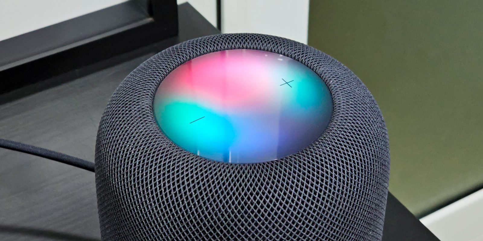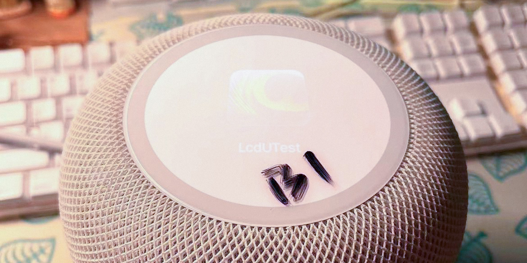
According to recent rumors, Apple is actively working on HomePod prototypes with a fully interactive display. More specifically, one of these prototypes identified as “B720” has the same form-factor as the HomePod 2, but with an LCD screen on top. But would this type of display on a HomePod really add much to the user experience?
The current HomePod experience
I have multiple HomePods spread around my apartment, from minis to a stereo pair of HomePod 2 in my living room. While I agree that HomePod is probably the best smart speaker alternative for those who are truly into the Apple ecosystem, there’s a lot that Apple could do to improve the HomePod experience.
One thing I miss about HomePod is having a way to quickly check useful information. Sure, I can always ask Siri things like the progress of a timer or the temperature inside my apartment, but I wish there was a way to keep this information always visible. There’s also the fact that Siri isn’t always helpful, and HomePod is mainly based on Apple’s virtual assistant.
I’m still hoping to see Apple rebuild Siri with more modern technologies, but until that happens, Siri will continue to play a completely different song to the one I asked for from time to time. I’d love to have some more advanced music controls right on the HomePod.
Apple could solve these two issues by putting a display in the HomePod, one that is capable of showing more than colors to indicate if there’s a song playing or if Siri is listening. And it seems that Apple is finally going to do that, but not in the best way, if you ask me.

What the rumors say
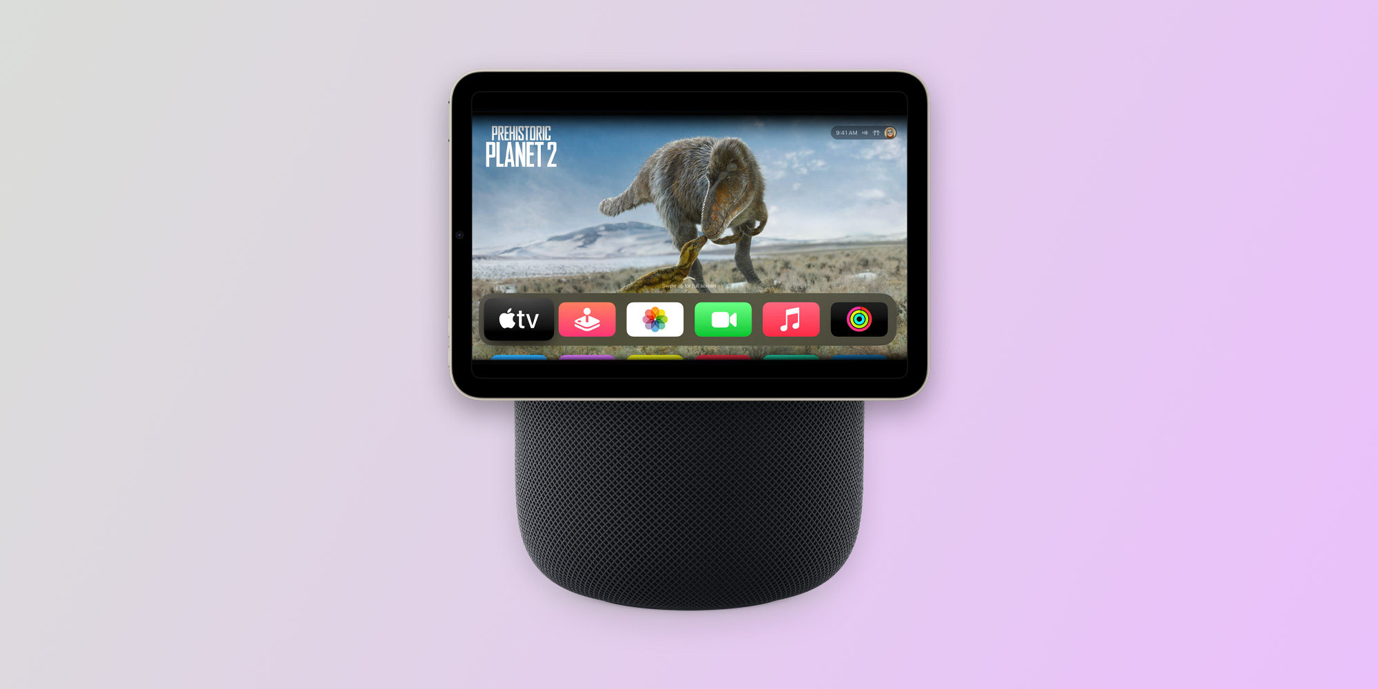
Looking back at all the rumors, Apple has been exploring different ways of putting a display on the HomePod. There’s a more ambitious prototype that looks more like an Amazon Echo Show, which basically has a tablet attached to the speaker. 9to5Mac recently reported that Apple has been internally running tvOS 17 builds on iPad minis as a concept for this HomePod.
But this more ambitious project may take longer to see the light of day. Until then, the company needs a quicker solution to make the HomePod more appealing to customers.
That short-term solution seems to be the B720, a HomePod that looks like any other HomePod we know, but with a multi-touch LCD screen on top instead of the current colored LEDs. But the more I think about it, the more I believe it would end up being more of a gimmick than a real improvement, and here’s why.
Would a HomePod with a display change anything?
The field of view of a screen on top of the HomePod would be quite limited, because it would require the user to be much closer to the device to see what’s going on. If I’m far away from the HomePod, I won’t be able to see what it’s showing me. This makes the display kind of pointless for things like constantly showing the clock or the weather.


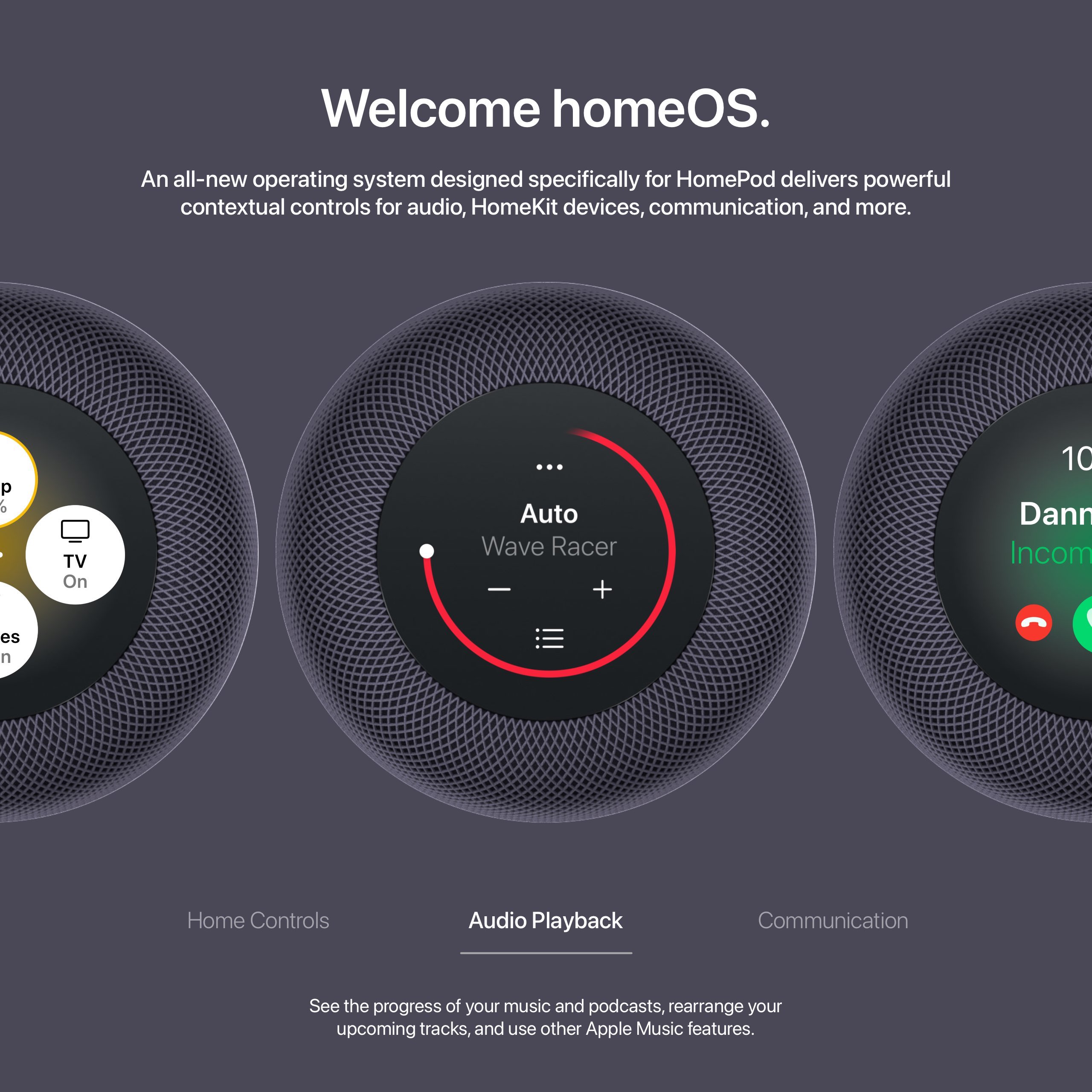
Still, there are some cool things this would enable, like choosing a song from your library right from the HomePod screen or checking the name of what’s playing at a glance. These are nice things, for sure, but I don’t see them drastically improving the HomePod experience.
And I’m not saying that Apple shouldn’t put an LCD screen on the current HomePod. I’m sure that would make a lot of users happy. But I’m still looking forward to that more ambitious HomePod with a large display that can show me song lyrics, videos, and let me quickly interact with Home app controls without having to ask Siri.
What about you? What do you think of the idea of having a screen on the HomePod? Let me know in the comments section below.
Add 9to5Mac to your Google News feed.
FTC: We use income earning auto affiliate links. More.


![Would you give up a physical keyboard and trackpad for an all-screen MacBook? [Poll]](https://www.blackbikertv.com/wp-content/uploads/2024/05/69630-would-you-give-up-a-physical-keyboard-and-trackpad-for-an-all-screen-macbook-poll-344x193.jpg)