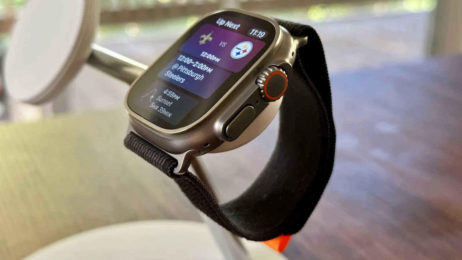
To my knowledge, Apple has never retired a watch face. Some are hardware specific, others are redesigned, but watch faces don’t leave the Apple Watch. I think that’s why the Siri watch face still exists for now, but it will need some love to stay relevant.
As of watchOS 10, the Siri watch face is six versions old. It debuted with much potential and made steps toward realizing that potential before it stalled. Now there’s a new widget system on Apple Watch that turns the Siri watch face into an antique. It still has some uniqueness to it, but I’m not sure that will be the case this time next year.
When the Siri face shipped in 2017, it was like a whole new Apple Watch interface from an alternate timeline.
“Lynch and team had to reengineer the Watch’s software twice before it was sufficiently fast,” David Pierce wrote in Wired in 2015. “An early version of the software served you information in a timeline, flowing chronologically from top to bottom. That idea never made it off campus; the ideas that will ship on April 24 are focused on streamlining the time it takes a user to figure out whether something is worth paying attention to.”
That’s a pretty good description of the Siri face that shipped in watchOS 4. From my coverage then:
The Siri watch face includes a digital clock with a flashing second indicator (but no option for seconds), two customizable complications including a new Siri complication, and two dynamic tiles of information. These tiles will update depending on time of day, date, current events, activity progress, and more.
Like other watch faces, swiping down from the top reveals Notification Center and swiping up from the bottom opens Control Center. Spin the Digital Crown on Siri face, however, and the timeline becomes a vertical carousel of information.
Rotating the Digital Crown downward shows Recent and All-Day tiles like temperature highs and lows and Now Playing cards. The tap minimizes to the top right corner with a light background indicating that it’s a button you can tap to return to the main view. You can also click the Digital Crown to leave the timeline and go back to the starting point.
Rotating the Digital Crown upward shows you tiles for Up Next and Tomorrow. Siri face previews the first Up Next tiles by default, and scrolling here reveals more. Rolling the Digital Crown lets you move around the timeline too.
Apple later added support for displaying sports scores as well as third-party app data sources. Adoption for a feature on a single watch face existed, but it only stayed relevant for a year or two.
The new widget system in watchOS 10 looks a lot like the Siri watch face. Swipe up from any watch face to see the day and date, time on an analog or digital clock based on your watch face, and a vertically scrollable display of widgets. You can sort the order of widgets, remove ones you don’t want, pin ones you really want, and add more widgets as apps update with support.
Key here is that widgets will work with any watch face. Any watch face except the Siri watch face, that is. Why? My first guess is that the swipe or scroll up method of invoking widgets is in total conflict with how you navigate the Siri face. This conflict alone was enough to push the Night Mode toggle on the Wayfinder face behind several taps and swipes. Things could change between now and when watchOS 10 ships in the fall, but the writing’s on the wall.
The Siri face isn’t completely toast … yet. It’s technically more information dense and more glanceable than the widget system. Complications and data sources are always in view on the Siri face, even if the data sources dynamically change based on context. Compare that to the widget system that requires touching the watch to summon and has no always-on display support.
You can also add persistent pieces of information with two customizable complication slots on the Siri face: one circle complication and one text/symbols complication.
Then there’s the intelligent aspect of the Siri face. Smart Stack widgets have intelligence as predicting what you want to see and when, but the Siri face has a few features that aren’t widgets yet. For example, the Siri face can show you heart rate recovery data in the minutes after completing a workout. The sports score integration is also so far unmatched by widgets.
That’s not enough to keep it relevant. Ultimately, I think each data source from the Siri face should become a widget. The Siri face could live on as a sort of dedicated widget watch face. It already looks like what a redesigned Siri face.
This is all Apple Watch work that can wait for watchOS 11 or 12, but I do think it needs to happen versus the other option: abandoning the Siri face and letting it languish.
Add 9to5Mac to your Google News feed.
FTC: We use income earning auto affiliate links. More.


