


Concept image by Parker Ortolani
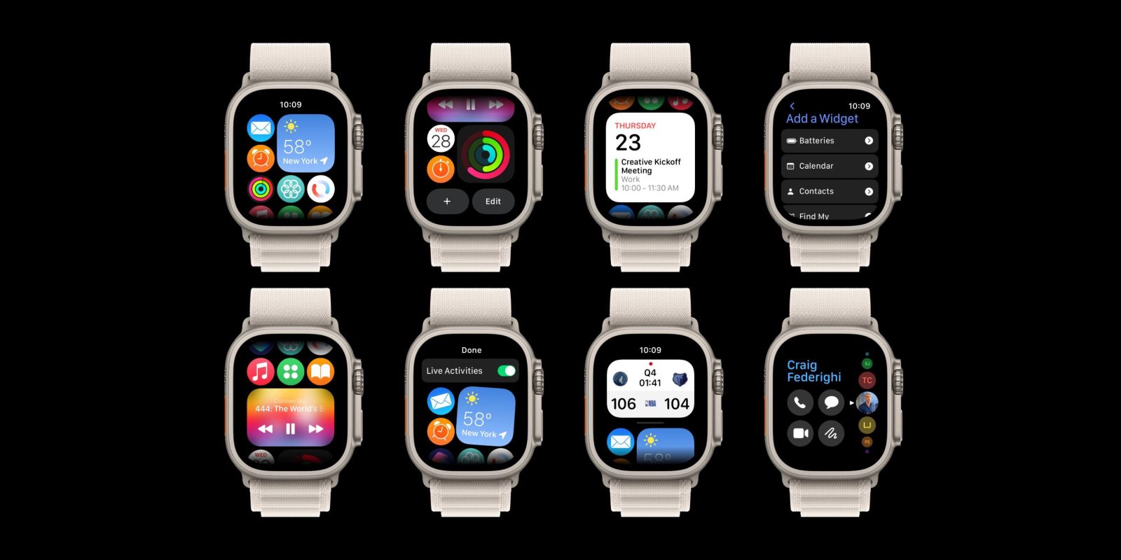
watchOS 10 that’s set to be unveiled at WWDC in June is believed to come with some major UI upgrades. Experimenting with what that could look like, Parker Ortolani has shared a few watchOS 10 concept ideas for an all-new Apple Watch Home Screen with widgets, Live Activities, one version with an evolved ‘Glances” UI, and more.
Earlier this month, Bloomberg’s Mark Gurman reported that Apple is planning “notable changes to the user interface” with watchOS 10. While he didn’t share any specifics, the UI is definitely ripe for an update.
Last week on the 9to5Mac Happy Hour podcast (at the 35-minute mark), my colleagues Benjamin Mayo and Chance Miller talked about what specific UI changes we could see including a new app launching/Home Screen experience with Live Activities, the Dock returning to pulling up favorite contacts, and more.
watchOS 10 concept
Now Parker Ortolani has visualized what a lot of those ideas could look and feel like with a slick watchOS 10 concept. Shared in a series of tweets, here’s a short animation looking at an overhauled Home Screen as well as some still images:
Here’s a more detailed look at how it could work… and with deemphasized apps the side button could be programmed again to work as a quick launcher for contacts but reimagined to better suit the digital crown… pic.twitter.com/Ipp3mnK5q3
— Parker Ortolani (@ParkerOrtolani) April 9, 2023
And here’s a different Home Screen approach made up of Watch widgets – bringing back an evolved version of Apple’s retired watchOS glances feature.
Racking up over 200,000 views and lots of positive feedback, Parker notes he’s been “floored” by the response to the concept and feels it “shows how hungry folks are for a big watch update!”
Floored by the reception to my watchOS home screen revamp concept.
Guess that just shows how hungry folks are for a big watch update!
pic.twitter.com/pk6qzPnCZs
— Parker Ortolani (@ParkerOrtolani) April 10, 2023
9to5Mac’s Take
I really like this concept from Parker. It’s exciting to see what a more customizable and functional watchOS UI could look like.
I think I’d find the more customizable Home Screen UI with widgets more practical over the all-widget UI, but both feel like big improvements compared to the current honeycomb grid or list view. Plus getting some choice with what the side button does would be fantastic along with Live Activities support.
What do you think about a more iPhone-like Home Screen with widgets for Apple Watch or a full-blown widget UI? Share your thoughts in the comments!
Add 9to5Mac to your Google News feed.
FTC: We use income earning auto affiliate links. More.


