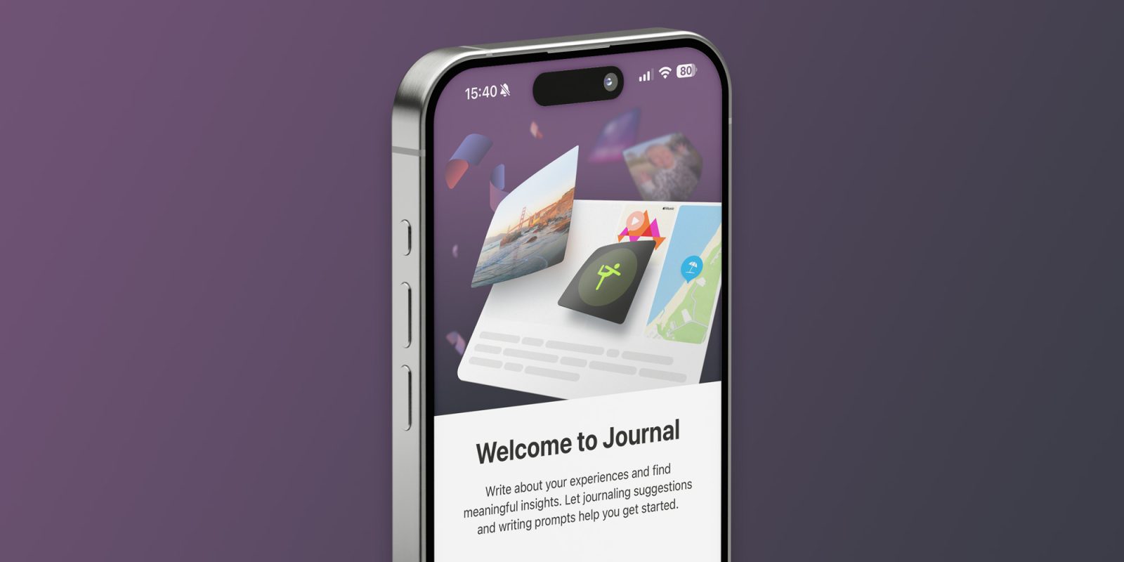
The first beta of iOS 17.2, released two weeks ago, introduced Apple’s new Journal app. The idea is to offer users some basic journaling features so that people can write about their day based on intelligent suggestions. But Apple’s Journal app is too simple, which could end up ruining it.
I’ve tried journaling several times using third-party apps like the popular Day One. However, I always end up losing interest and forgetting to write about my days at some point. Since I’m running iOS 17.2 beta on my iPhone, why not try Apple’s Journal app? And that’s exactly what I’ve been doing since the beta was launched.
First, I need to make this disclaimer: I know I’m writing about a beta app – the first beta, to be precise. Things may change between now and the final release later this year, and of course, I’ll be careful not to talk about bugs and confirmed features that aren’t yet working properly in this beta.
How Apple’s Journal app works
When Apple announced the Journal app at WWDC 2023, the company said it would provide a simple and easy way to let users journal. The app offers suggestions based on your photos, music you’ve listened to, places you’ve visited, and people you’ve texted with to generate suggested memories.
You can either create a new blank entry or use the suggestions to add text, more photos, a specific location, and even a voice memo. The suggestions (except for photos) aren’t showing up here for some reason, but I guess that’s just the beta being beta. New entries can be created for the current day or any other date you choose.
The app is very clean in terms of interface, and there aren’t many complex options that make you think about how to use it. This is great, as the focus is all on the content. The app’s main screen works like a social network feed in reverse chronological order so that you can see all your memories.

I like how the Journal app shows a preview of what you’ve written along with thumbnails of the photos, videos, and any other content you’ve added. If you tap on an image or video, the app expands it to full screen with details of when it was captured. You can also explore the map when it comes to locations.
Apple’s Journal app lacks some basic features
As I add more entries to my Journal app, I realize it lacks some essential and basic features.
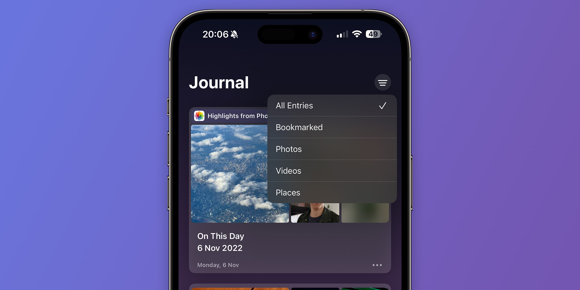
I immediately missed a keyword search. The app has some basic filters, but they only let you filter entries by photos, videos, or other media. This may seem okay now, but it will become a problem as I add more entries since there’s no way of searching for a specific one. What happens when I have 60 or more than 100 entries?
I’d also love to have a calendar-based search to pick a date and see what happened that day. Another great feature would be a map to explore entries based on locations (the filter only lists all entries with a location).
But what annoys me most is that Apple’s Journal is an iPhone-only app. There are no iPad or Mac versions yet, and there’s no evidence that there will be any time soon as the company focuses on improving the iPhone app first. I’d write more about my day if I could use my iPad Pro with Magic Keyboard instead of my iPhone.

Wrap up
Overall, Apple’s Journal app works fine for those who simply want to register something about their day. However, this extreme simplicity could become a problem in the future, and it certainly makes me think there will still be plenty of room for third-party journaling apps. Hopefully, the Journal app will improve over time, but I might switch to another app for now.
Have you been using Apple’s new Journal app? What are your thoughts on it? Let me know in the comments section below.
Add 9to5Mac to your Google News feed.
FTC: We use income earning auto affiliate links. More.


