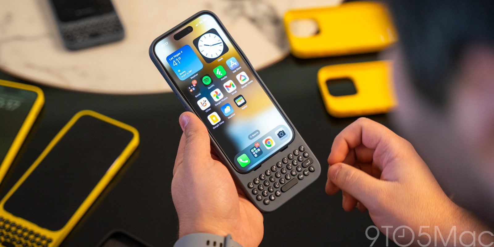
Smartphones and physical keyboards aren’t a combination we think of often, but Clicks for iPhone is trying to bring that back with a new keyboard case that’s extremely good. That is, for what it actually is.
The iPhone killed the physical keyboard, but there have been attempts to bring it back, such as Blackberry’s Android-powered KeyOne and KeyTwo smartphones. But on many other devices, adding a physical keyboard has led to compromises. On those Blackberry phones, the compromise was the size of the screen. On others, it might be thicker, or clunkier hardware. And, if you’re an iPhone user, it also meant moving over to Android.
So, the obvious solution is to just attach that to a case. Previous attempts at this concept have fallen quite flat, with the Ryan Seacrest-backed “Typo” being the most notable. But where they failed, Clicks is clearly taking the approach of trying to come up with the best possible version of this concept
Admittedly, this is a concept that seems rather easy, but there is a lot you have to get right. There’s the way the keys feel, the way they’re spaced, and how it all attaches to the phone. A lot of that can quickly go wrong, but in a hands-on demo at CES 2024, Clicks really impressed me in its quality.
The first question I had about Clicks was how easy it is to put your iPhone into it and take it back out, and the good news is that it’s very quick and easy. The bottom half of the case is a stiff silicone material, but it seamlessly melds into a super flexible material towards the top.
Visually it’s impossible to see, but you can feel the difference a bit in the grip a little bit. That flexible top is what makes it easy to slide the iPhone into place. You rest it on top and slowly slide it into the case. The “hard” part is getting the charging port perfectly aligned, but I did it a few times and never once had too much of a problem with it.
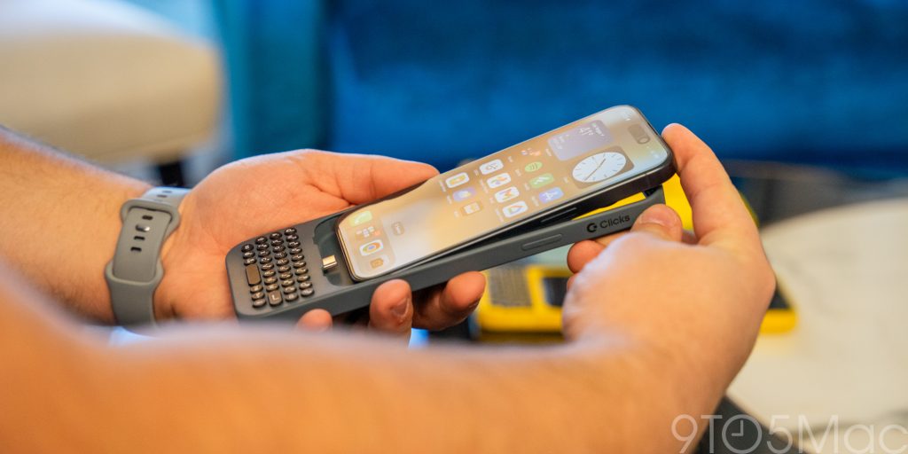
The only downside I found to that flexible silicone is that, around the buttons, the silicone tends to bend out on the sides a bit. It’s not a big deal, but it is definitely a little frustrating. This is a good time to mention that the units I tried were largely pre-production, and Clicks told me that the final version will be a bit stiffer in this regard.
Much more important, though, are the keys themselves. For a case built for this express purpose, the keys are crucial to get right, and Clicks has nailed it, I think. The keys are rounded and have a bit of space in between each one, but the layout overall feels familiar and well done. The keyboard layout is also specifically designed to be really similar to the default iOS keyboard, which makes it feel all the more familiar.
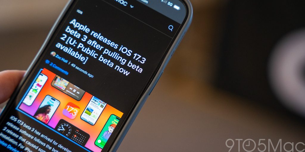
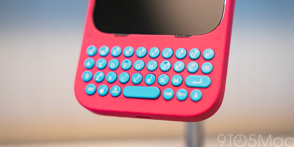
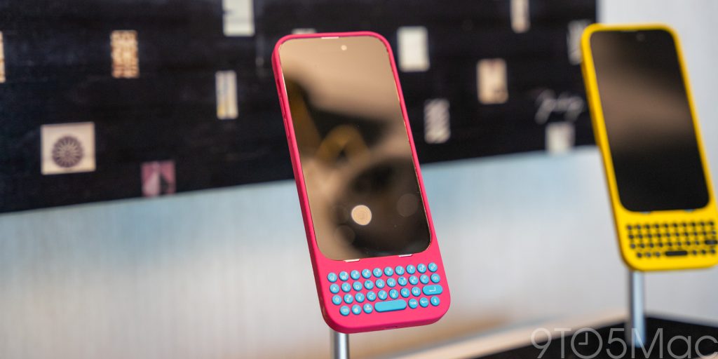
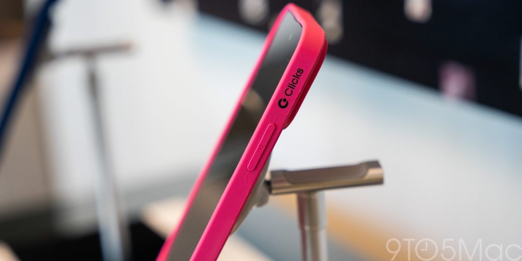
Each key is also backlit and has an excellent tactile response. That’s the aspect I was most concerned about, and while some of the pre-production models were a little rough, the final version that I was able to test during my hands-on (not pictured) felt perfect. It was clicky and tactile without being loud or too hard to press.
Similarly perfect was how this works in iOS itself. I was able to plug my iPhone 15 Pro directly into a Clicks keyboard and use it without hitting any permissions or special changes. I just plugged it in and I was able to immediately start typing and using keyboard shortcuts.
What’s the typing experience like? Honestly, I think this is going to vary from person to person. In my case, I was able to get going with some reasonably quick typing after a few minutes, but it wasn’t as quick as I can type on a digital keyboard. Muscle memory and actually using the product over time is going to play a huge role in every individual’s personal experience.
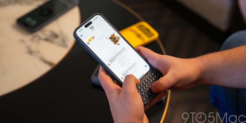
But, of course, then there’s the elephant in the room.
The obvious downside to Clicks is that it adds a lot of size to your iPhone. It’s clear in pictures, and it’s absolutely a thing in real life too.
In active use I don’t really find the size to be a problem, at least on the smaller iPhone size, but it makes an iPhone Pro Max feel quite unwieldy. It’s something one could get used to, but the iPhone 15 Pro Max is already huge, and adding a big section at the bottom makes that difficult. The benefit, though, is that the keys are bigger and more uncomfortable. On the smaller phone, they’re much smaller, and typing is a bit harder.
In my brief time using it, I’m very much of the opinion that Clicks is pretty much as good as this concept can be. It’s well-designed, comfortable to use, and hits all of the right notes. I’d like to maybe see a version of this where the keyboard slides out, but that would come with its own set of trade-offs that I’m not convinced would be worthwhile.
Similarly, I’m also still having trouble figuring out who this is really for.
On the one hand, there’s the pitch for people who just love physical keyboards, and in that regard, this is fantastic. The other pitch is towards content creators, who could benefit from the extra screen space a lot. Personally, I’m not really in either of those camps, but I’m really curious to give this a shot outside of a briefing room to really see how it fits into daily life.
Clicks starts shipping in February for the iPhone 14 Pro, and in March for the iPhone 15 Pro and iPhone 15 Pro Max. Pricing starts at $139. Are you interested?
More CES 2024 coverage from 9to5Google:
- What’s coming to Android in 2024
- The Rabbit r1 is a wild AI companion that works with your favorite apps
- Hands-on: I really want a tiny version of TCL’s NXTPAPER 14 Pro [Gallery]
- Hands-on: The Xgimi Horizon Max is ‘the one to watch’
- Hands-on: Lenovo’s Windows/Android hybrid laptop is a crazy idea turned into reality [Video]
- AAWireless 2 quick look: How it compares to the original Android Auto adapter [Gallery]
Follow Ben: Twitter/X, Threads, and Instagram
Add 9to5Mac to your Google News feed.
FTC: We use income earning auto affiliate links. More.


![Hands-on: Clicks for iPhone is maybe the best possible version of a keyboard case [Gallery]](https://www.blackbikertv.com/wp-content/uploads/2024/01/59410-hands-on-clicks-for-iphone-is-maybe-the-best-possible-version-of-a-keyboard-case-gallery-1200x500.jpg)


![Hands-on with Linearity Move, a simplified animator for everyone [Video]](https://www.blackbikertv.com/wp-content/uploads/2024/04/65765-hands-on-with-linearity-move-a-simplified-animator-for-everyone-video-344x193.jpg)
