I’ve been running the iOS 18 beta since a few hours after WWDC last month. Now that the public beta is available for everyone, I figured I’d share some early thoughts on a few of my favorite iOS 18 features so far.
iPhone Mirroring
It’s rare when I use a new technology and genuinely find it magical. A few years ago, Universal Control elicited that reaction, as did Vision Pro when I tried it at WWDC 2023 (for very different reasons, of course). iPhone Mirroring in iOS 18 and macOS Sequoia is another example, letting you mirror your iPhone’s display on your Mac.
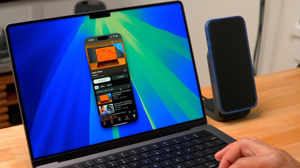
This feature may sound basic on paper, but there’s more to it than you’d think. I think the most impressive part of it is the notifications integration. When you get a notification on your iPhone, it also appears on your Mac. When you click the notification on your Mac, it instantly opens iPhone Mirroring and takes you directly to the app.
This feature works even if you don’t actively have iPhone Mirroring enabled. When you click the notification on your Mac, it will automatically connect to iPhone Mirroring.
One other iPhone Mirroring tidbit: there are keyboard shortcuts! When using iPhone Mirroring on your Mac, pressing CMD+1 takes you to the Home Screen, CMD+2 opens the app switcher, and CMD+3 brings up Spotlight Search.
I hope Apple makes it possible to access Control Center and Notification Center on your iPhone via iPhone Mirroring at some point, but this is a great start.
Redesigned Control Center
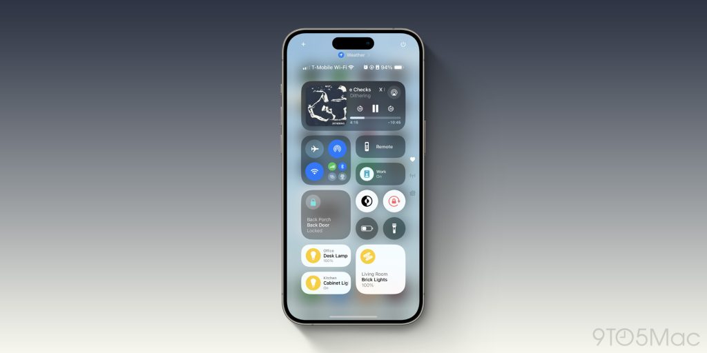
This is something that feels like it’s been rumored every single year, but never actually came to fruition – until now. iOS 18 adds a completely overhauled Control Center experience.
There are multiple parts to this. First, you have full control over the layout of Control Center. In prior years, you could add and remove toggles with the Settings app, but there wasn’t really any customization available. With iOS 18, the world is your oyster. The entire experience can be personalized, you can have multiple pages of controls, different sizes for each control, and more.
Notably, this includes the Home app. You can now have complete control over which HomeKit accessories show up in Control Center, which wasn’t previously possible. This alone is a huge quality-of-life update afforded by iOS 18.
Using the new Control Center comes with a learning curve. The process of arranging controls can be a bit painstaking, and it’ll take a while to re-learn a completely new layout. After a few days, however, I was used to everything.
I’m super eager to try out controls from third-party apps. At WWDC, Apple showcased Ford’s plans to integrate with the new Control Center, and as someone who drives a Ford, I’m looking forward to this.
Another impressive part of this new ecosystem is that anything available to Control Center can also now be assigned to the iPhone 15 Pro’s Action button. This gives you a bunch more options for customizing your Action button.
Messages app improvements
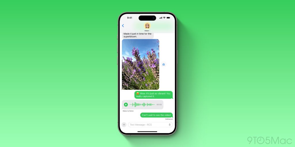
I spend a lot of my life in Messages, both for work-related communication and personal communication. With iOS 18, Apple’s strategy seems to have been: “conquer the low-hanging fruit,” and that’s exactly what they did.
The ability to use Tapbacks with any emoji is a long time overdue, but I’m already loving it. Scheduled send is a useful feature, especially for texting with people across vastly different time zones. The new text effects feature is another fun way to add some personality to your messages.
I haven’t forgotten about RCS. There are only a few people I talk to who don’t have iPhones, and one of them has an Android phone (or maybe a carrier?) that doesn’t support RCS. Still, it was quite jarring and surprising – in a good way – to see read receipts and typing indicators while chatting with a green bubble friend over the weekend.
Again, these new Messages features in iOS 18 are revolutionary. In fact, most of them really should have been here years ago.
Other small tidbits
- This one isn’t working for me yet, but I very much look forward to being able to set my preferred Home Hub for HomeKit. Talk about a “finally” feature.
- Speaking of “finally,” the new Passwords app is great. I rely on AutoFill in Safari for virtually everything, but it’s nice having a dedicated place to go to manage my logins, manually copy and paste passwords, and see Wi-Fi network information.
- There are some nice tweaks to the CarPlay experience, including contact pictures for notifications, bolder colors and icons for Apple Maps, and integration with sports scores from Siri.
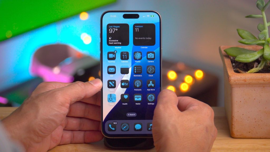
- You’ll notice I didn’t mention the new Home Screen customization features in iOS 18. While I’m really glad these options exist, they aren’t for me (with the exception of dark mode).
- I really like the new Photos app design. It’s an adjustment for sure, but the new customization and layout options are excellent for arranging things just the way I’d like.
Wrap up
There are a lot of changes, big and small, in iOS 18 so far, but these are a few things that have stood out to me so far. Another thing I keep reminding myself is that this is only the first part of the iOS 18 story. We’re still waiting on the first Apple Intelligence features to roll out, and some of the more advanced features won’t be ready until next year.
Are you running the iOS 18 beta? What are some of your favorite features so far? Let us know down in the comments.
Add 9to5Mac to your Google News feed.
FTC: We use income earning auto affiliate links. More.


