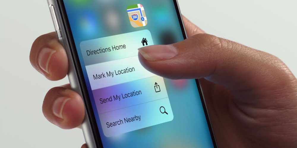
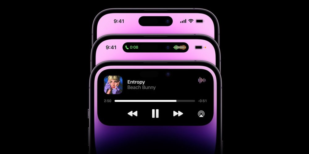
Stand back, folks, this take is comin’ in hot. The Dynamic Island introduced with the iPhone 14 Pro is really clever. Apple turned boring sensors into an interactive element that’s very marketable and potentially useful. 3D Touch, on the other hand, was a flagship feature on iPhone 6s, but the very useful feature was hardly marketable and even less discoverable.
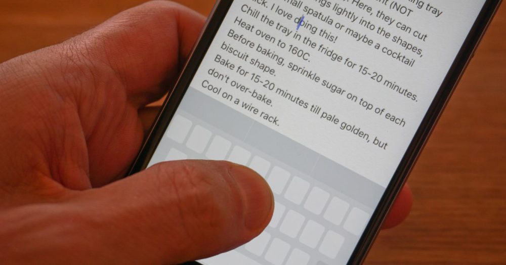
Pressure sensitive display technology is very cool! The tech feels like the sort of innovation that shouldn’t be thrown out, but instead maintained with the progression of the iPhone. Being able to distinguish between a tap and a deep press will always be quicker than a long press. Imagine if secondary-clicking on a Mac trackpad couldn’t be done with a two-finger tap and required a long press instead. No thank you.
Speaking of the Mac, it’s the last place pressure sensitive tech still exists for Apple. The feature is called Force Click, and it allows you to access “Quick Look, Look up, and variable speed media controls” on macOS.
Apple Watch debuted with its own version of a pressure sensitive display feature called Force Touch, but software support was removed and recent watches haven’t included the hardware for it. The same thing happened with the iPhone. In both instances, Apple replaced pressure sensitive input with on-screen buttons or long presses that are slower to access than firmly pressing the display.

The fact that Apple used 3D Touch, Force Touch, and Force Click to identify three similar features on different devices was certainly the butt of lots of jokes.
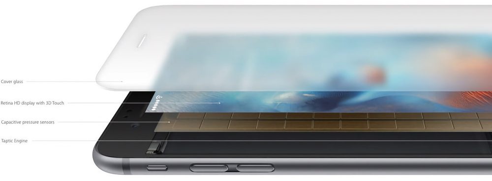
Practically speaking, though, you don’t need to know what the marketing name for pressure sensitive input features are given. The differences are inherent to the hardware. 3D Touch on iPhone allowed you to access different features on different parts of the screen, Force Touch on the watch was less specific and treated the whole display as a single button, and Force Click is the same thing but on a trackpad.

So why did 3D Touch/Force Touch get retired? Discoverability was a major critique. If pressure sensitive displays returned, Apple could use the current long-press options and tie the same functions to 3D Touch. The watch could let you choose between visual buttons or a cleaner look with Force Touch. Best of both worlds, right?
The other reason for 3D Touch and Force Touch going away is battery life. The feature wasn’t power intensive, but it did take up physical space in a compact housing. Some people liked 3D Touch, but everyone enjoys more battery life. Removing the feature saved space for more battery capacity and other components.

A few things have changed since 3D Touch and Force Touch were discontinued though. Apple Watch Ultra sacrifices cutting-edge design for best-in-class battery life. I would buy a second-gen Apple Watch Ultra that factored in the extra battery life and made room for Force Touch. Apple is also rumored to be working on an iPhone Ultra that may make similar tradeoffs. Cost is another factor for omitting pressure sensitive display tech, but Apple Watch Ultra and the current iPhone 14 Pro Max are less price-sensitive than more compact devices anyway.

What does any of this have to do with iPhone 14 Pro’s Dynamic Island? Nothing really. I just think 3D Touch was instantly useful and Dynamic Island is taking more time to prove itself. 3D Touch was considered in almost every Apple app from the start. Dynamic Island adoption, even by Apple, is just getting started. Dynamic Island might even be useful by the time the iPhone 15 is unveiled! Firmly pressing the Dynamic Island to expand the blob could even settle the debate over what should happen when you tap and when you long-press.
Agree or think I’m way off base? Let me know in the comments.
FTC: We use income earning auto affiliate links. More.


